
Artisan Bakery Brand Identity Kit
Build the Visual and Verbal Identity That Communicates What Your Bakery Is Before the Customer Tastes a Single Thing
Something happens in the four seconds before a customer picks up a product.
They have not tasted it. They have not read the ingredient list. They have not asked anyone about it. But they have already formed an impression — of the price point they expect, of the quality they anticipate, of whether this product is for them or for someone else.
That impression comes from the brand. The typography on the label. The color palette on the packaging. The photograph on the Instagram post they saw that morning. The tone of the caption under it. The logo on the front of the counter. The font on the handwritten specials board. Whether the handwritten specials board looks intentionally artisanal or just like nobody owns a printer.
Brand identity in food retail is not a nicety for businesses that have reached a certain scale. It is the first communication between the baker and the customer — and it is happening constantly, in every touchpoint, whether or not the baker has designed it intentionally.
Undesigned brand identity communicates something. It just rarely communicates the right thing.
This kit designs it intentionally.
📥 Digital download only. Everything you need to build a coherent, professional bakery brand identity. Available immediately.
THE KIT COMPONENTS — IN FULL
PART ONE: THE BRAND STRATEGY FOUNDATION
The Brand Positioning Statement
The sentence that answers the most important question in brand strategy: who is this bakery for, and what do they get here that they cannot get everywhere else?
Not a mission statement. Not a list of values. The positioning statement: the category (what type of bakery), the target customer (the specific person — not “anyone who likes baked goods” but the actual person), and the differentiating benefit (the specific thing this bakery offers that the customer cannot get from a comparable alternative).
Examples of strong positioning: “The neighborhood sourdough bakery for home bakers who want to understand what they are eating.” “The celebration cake studio for couples who want custom work without the wedding cake industry’s price structure.” “The high-welfare, locally sourced breakfast pastry counter for the weekday commuter who wants one daily treat they feel good about.”
The workbook guides the baker through the positioning exercise: the customer archetype identification (the specific person, their lifestyle, their values, their relationship with food), the competitive landscape mapping (who else serves this customer, what they offer, where the gaps are), and the differentiator articulation (the thing this bakery does that those alternatives do not).
The positioning statement that results from this exercise becomes the filter for every subsequent brand decision. Does this font fit the brand? Does this color serve the brand? Does this Instagram caption sound like the brand? All of these questions are answerable once the positioning is clear. 🎯
The Brand Personality Framework
The four brand personality dimensions that define how the bakery communicates: the tone (warm through authoritative — where on the spectrum does this bakery sit?), the vocabulary (everyday through technical — does the brand use the language of home baking or the language of professional pastry?), the visual energy (minimal through abundant — does the brand communicate through restraint or richness?), and the humor register (serious and earnest through warm and playful — is this a bakery that makes you smile or one that makes you feel the weight of craft?).
The four dimensions plotted for the specific bakery, producing the personality guide that keeps all brand communication consistent regardless of who is writing the Instagram caption or choosing the packaging supplier.
The Brand Story
The narrative that makes the bakery a character rather than a business. Not the founding story as chronological biography — the founding story as the reason the customer should care. The workbook guides the baker through: the origin moment (the specific thing that happened that led to this bakery existing), the obstacle (the challenge overcome — the story element that makes the narrative human), the transformation (what changed), and the mission (the reason the bakery still gets up at 4 AM).
The three-hundred-word brand story that goes on the website’s About page, the two-hundred-word version for printed brand materials, and the fifty-word version for social media bios. One story, three formats. 📖
PART TWO: THE VISUAL IDENTITY SYSTEM
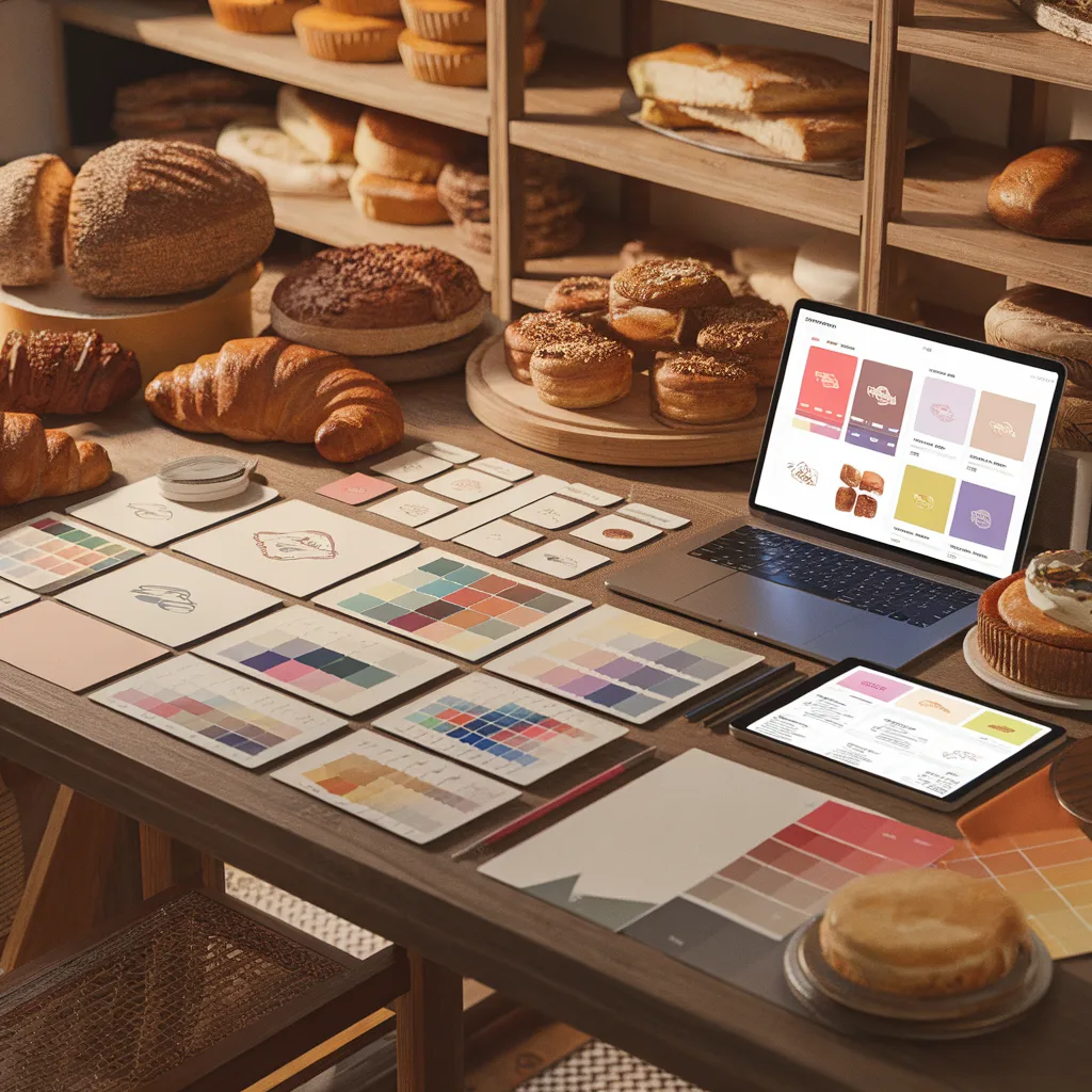
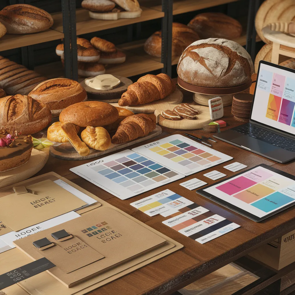
The Color Palette Architecture
The complete color system for an artisan bakery brand: not just the two colors that look nice together, but the full system that works across every application.
Primary color: The dominant color — the one that appears on the logo, the primary packaging background, and the primary brand touchpoints. The color that a customer associates with the brand without thinking about it.
Secondary color: The complement that creates visual interest when paired with the primary. The color for secondary elements, accents, and contrast.
Accent color: The unexpected element — the color used sparingly to create emphasis and energy. The color on the ribbon, the seal, the seasonal limited edition label.
Neutral palette: The background and text colors — the off-whites, creams, and warm grays that give the primary and secondary colors room to breathe.
The workbook includes: the artisan bakery color palette reference guide (thirty curated palette systems organized by bakery type — traditional European, modern minimal, French patisserie, Nordic influenced, American nostalgic, Asian-influenced, and others), the CMYK and RGB values for print and digital application of each, and the color psychology notes for the key brand color families.
The hex codes, CMYK values, and Pantone references for print production. The color ratio guide — the visual rule for how much of each color appears in any given design application. 🎨
The Typography System
The type selection for an artisan bakery brand requires balancing two competing needs: legibility at small sizes (on labels, on packaging, on small-format print) and personality at large sizes (on signage, on social media graphics, on the website header).
The workbook covers: the three-font system for artisan food brands (the display typeface for headlines and brand applications where personality is primary, the supporting serif for body text in formal applications, and the accent script or hand-lettered element that appears selectively — the ingredient that appears sparingly enough to retain impact), the type pairing guide with thirty tested pairings organized by brand personality, and the type application rules (which font at which weight for which application — the consistency guide that prevents the brand from looking like a different design studio made each piece of communication).
The Logo Concepts and Development Guide
The workbook is not a logo designer — it provides the brief, the direction framework, and the evaluation criteria that produce a logo brief clear enough to give to a designer (whether professional, freelance, or a design tool like Canva) and evaluate the results with confidence.
The logo brief framework: the required formats (the primary horizontal or stacked lockup, the simplified icon or monogram for small applications like social profile images and packaging seals, and the black-and-white version for single-color printing), the design language direction (the visual vocabulary that matches the brand personality — the illustrated versus typographic versus abstract versus iconographic direction), the things the logo must communicate, and the things it must not look like.
The logo evaluation criteria: the seven questions that determine whether a proposed logo is right for the brand or merely appealing in isolation. ✏️
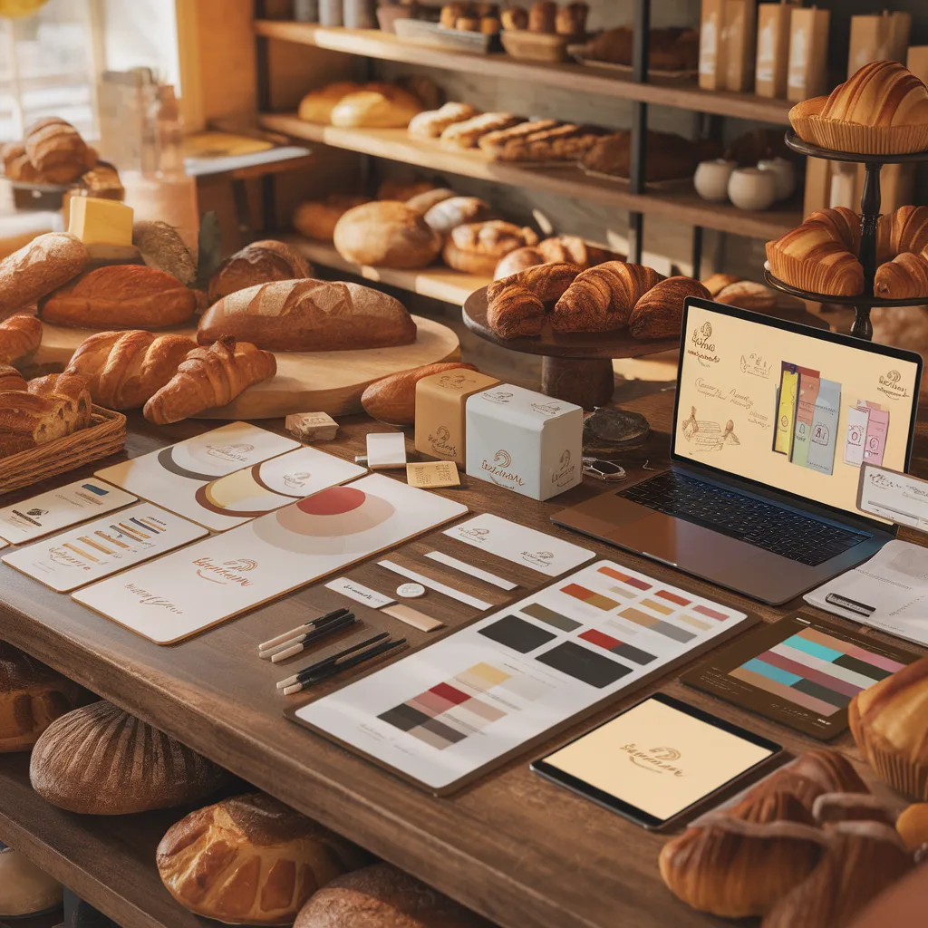
The Photography and Visual Style Guide
The Instagram grid, the website, the printed materials — every visual channel requires photography, and inconsistent photography undermines a strong logo and color system. The visual style guide covers: the lighting direction (the food photography lighting style that fits the brand personality — the bright and airy versus the warm and moody versus the dark and editorial), the composition approach (the overhead flat lay versus the 45-degree angle versus the close-up detail), the props and surface selection (the surfaces, linens, and background props that reinforce the brand’s visual world), the editing style (the color grading direction — warm, cool, neutral, high contrast, low contrast), and the subjects covered beyond product (the hands, the process, the bakery environment shots that give the brand human context).
PART THREE: THE VERBAL IDENTITY SYSTEM
The Voice and Tone Guide
How the bakery writes across every context: the social media post, the product description, the email newsletter, the response to a Google review, the menu board, the packaging back panel.
The voice is consistent (it is always the brand speaking). The tone adjusts (the tone of a celebration — a new product launch — is different from the tone of an apology — a product that was unavailable, a delayed order). The guide covers both: the brand’s writing voice in ten words that describe how it sounds, the do-and-do-not lists for vocabulary (the words the brand uses and the words it never uses), and the tone adjustment guide for five common communication scenarios.
The Product Description System
The most underutilized brand touchpoint in most bakeries: the written product description. The product name on the label or menu board, and the two to three sentence description that goes under it.
Most bakery product descriptions describe ingredients. The best product descriptions describe experience. The difference: “Almond croissant with frangipane filling and roasted almond topping” (what it contains) versus “Twice-baked the way it was always meant to be — the outer shell shatters, the frangipane inside gives, and the roasted almond on top tells you exactly what you are about to experience” (what it feels like).
The product description formula, the vocabulary bank of sensory language organized by flavor category (sweet, acidic, bitter, rich, light, spiced), and twenty example descriptions across different product types demonstrating the formula in practice. 📝
PART FOUR: THE BRAND APPLICATION GUIDE
The Touchpoint Inventory and Priority Map
Every physical and digital surface where the brand appears — the logo, the packaging, the counter signage, the staff uniforms if applicable, the website, the social profiles, the email newsletter template, the order confirmation email, the loyalty card, the delivery box, the tissue paper — organized by impact on customer perception and investment required to address.
The priority map that tells a bakery at any stage where to invest brand design effort first for maximum return, and the rollout sequence for building brand consistency over time without requiring everything to be perfect at launch.
The DIY Design Tool Guide
For bakeries designing their own materials in Canva, Adobe Express, or equivalent tools: the template setup guide (how to save brand colors, fonts, and logo elements as brand kit settings so every new design starts from the correct foundation), the grid and alignment principles for professional-looking layouts, and the fifteen design mistakes most common in small food business branding (the font that is too small to read on a label, the low-resolution logo that pixelates on print, the all-caps serif that reads as hostile rather than elegant).
📂 COMPLETE FILE LIST
🎯 Brand strategy workbook — positioning, personality, story (editable PDF) | 🎨 Color palette reference guide — 30 curated artisan bakery palettes with print and digital codes (PDF) | ✏️ Typography pairing guide — 30 pairings with application rules (PDF) | 📷 Photography style guide template (editable) | 📝 Product description formula and vocabulary bank (PDF) | 🏷️ Logo brief framework (editable) | 📋 Brand touchpoint priority map (editable) | 💻 Design tool setup guide for Canva and Adobe Express (PDF)
Reviews
There are no reviews yet.